
The Golden Hue
I am currently finishing my graphic design certificate at UC Berkeley Extension. During my portfolio class I ran into a project where we needed to create an advertising campaign featuring an artist. I paused at that brief for a moment technically I have exhibited in two group galleries in Cairo, which technically makes me an artist. So I chose myself. But what comes after traces back to a memory from January 2024.
I had recently moved to Sacramento, California. I have a relative who has lived in the US since the sixties and spent more than a decade in San Francisco, so she took me and my husband to Point Bonita Lighthouse. That is where I met my golden hue.
It was around two thirty in the afternoon. The fog was doing what fog does in the Bay Area in winter flattening everything, softening the edges, cooling every color down. Purple. Blue. A quiet touch of pink. The kind of light that feels like the day is already apologizing for itself.
And then in the middle of all that, a golden hue. Not a sunset. The sun wasn't going anywhere yet. It was simply there, sitting inside the cool without asking permission. I didn't have an explanation for it. I just stood there looking at it.
I lost the photo. I'm still a little annoyed about that.
When I got home I started painting immediately. Not literally I didn't try to reproduce Point Bonita on a canvas. I painted what the light made me feel, which turned out to be an abstract portrait in a geometric style I had never drawn before. My painting style evolved, I suppose. A large section of it was yellow meant to hold the happiness and amazement I felt standing in front of that unexpected color.
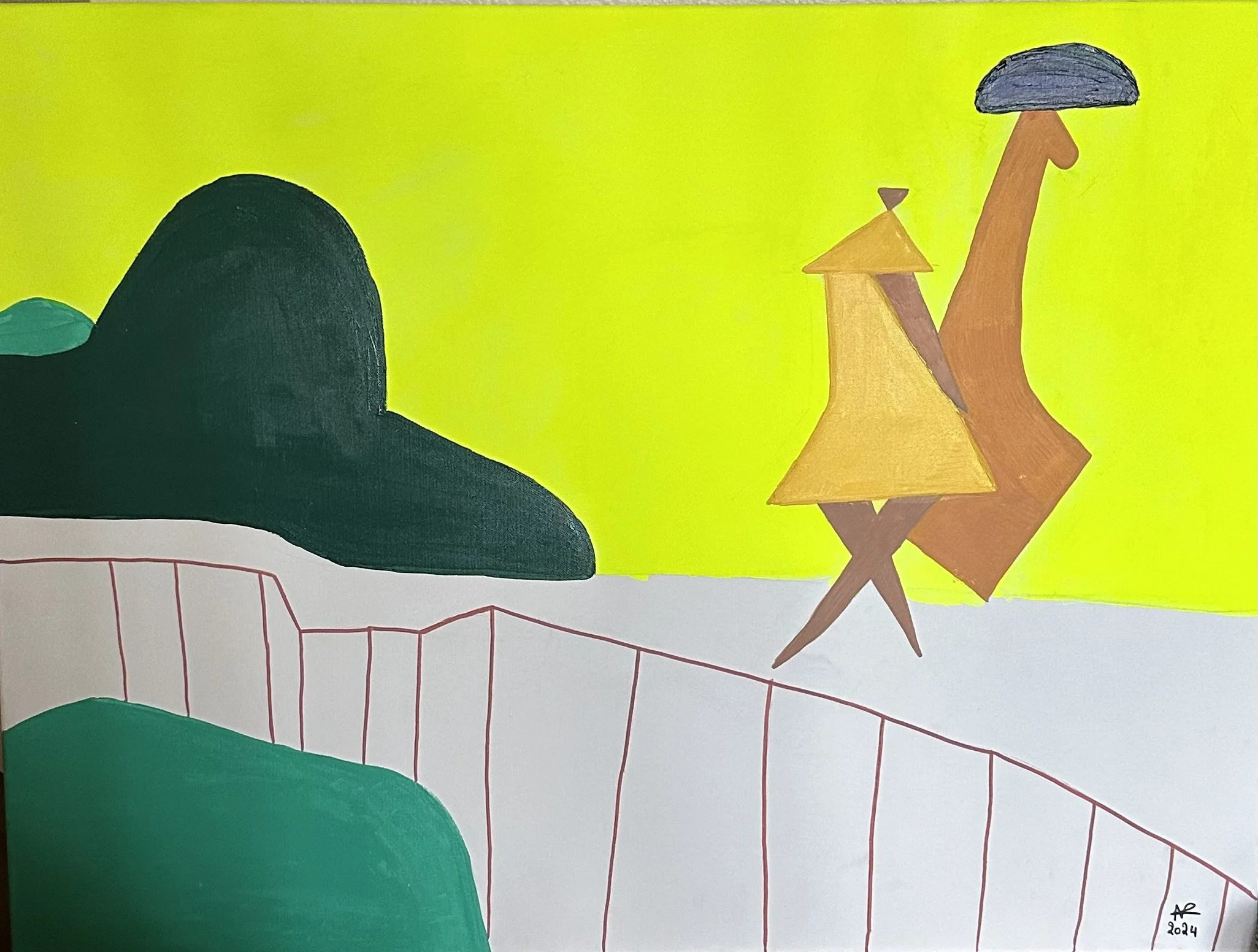
So when the Berkeley project came around, I chose this style. A portrait without a specific face can become anyone. It can stand in for a model in any campaign.
What I did not expect was the feedback. Nobody said it was too abstract. Nobody said it was too artistic, too ambiguous, too much of the wrong world for advertising. The feedback I received was to create more portraits different ones, for diversity representation. The campaign had absorbed the art completely.
The thing that is supposed to make art incompatible with commercial work the emotional openness, the lack of literal instruction had become exactly what made it useful.There is an assumption in both worlds that art and design are separate practices that should stay in their own lanes. Art is emotional, ambiguous, elite. Design is functional, clear, accessible. Advertising especially tends to keep art at a distance too risky, too open to misreading.
But that afternoon at Point Bonita, the golden hue didn't ask whether it belonged in that cool foggy light. It just showed up. And it was the most interesting thing there.